Examples And a Free Template To Get You Started
You’ve gotten a lead on a really sweet client.
The kind that makes you do a happy dance. You quickly research their company, their branding and their social media outlets. You’re ready to make a Skype date to talk about their needs and goals. You usually grab a pen and pad and scribble notes while talking with them. And you’re so excited about the project, ideas are already flowing that you can’t wait to start. But what happens when you get off that client call and realize you forgot to ask some important questions? You don’t want to start your design only to discover that what you thought they wanted and what YOU wanted are two different things. Or worse, you thought you knew what they wanted, submitted the designs, and it wasn’t what they needed; you’re not only back to the drawing board, but you may have lost credibility.
That’s where a Detailed Design Brief would set you up to create great design. It answers all of the questions you’ll need for the project — and you won’t have to email the client to ask them questions you should’ve gotten up front. It’s a definite blueprint for the project, with a clear set of expectations and goals.
Not having a clear design brief is like going grocery shopping for someone with a shoddy list. They’ll tell you they want two bell peppers, a loaf of bread, cheese and cereal. You grab the list, head to the store and quickly realize you don’t know what kind of cereal or cheese they want. You can guess, be embarrassed when you’ve made the wrong choices and then have to go back to the store. Or you can call them midway through your shopping trip, but you will then look like you can’t handle the task.
When creating a design brief, imagine anything and everything you may need to complete the project. You don’t have to ask all of these questions (it may depend on the project), but sometimes more information is better than not enough.
Start by doing your research before the call or meeting. Check out their website and social media profiles. Google any articles about them. Read their blog.
Some design briefs are submitted and completed by the client and then handed off to the designer. But if you’re a designer working directly with the client, going through the questionnaire with them can get you more detailed responses and more clarity if you’re not sure of an answer.
Here are 10 questions to start with that’ll give you the information you’ll need to get started:
Who are they and what do they do?
What’s the size of their company and how long have they been in business? How did they get started in this business? What is their product or service? How do their customers or clients talk about them?
Get more details: Have the client describe their business as if they just met you at a party and not at a conference trying to sell you.
People get in the habit of selling their business instead of talking about it.
Ask them to describe the company in layman’s terms if it’s something you’re not very familiar with. What do they love about their company and what are they most proud of?
What is the scope of the project?
What is the project? Why do they need you? What materials do they need?
Consider this checklist:
- If they need a logo, do they want a type treatment, an image or both?
- If it’s a web design project, ask if they also need a developer.
- Will they make an entire ad campaign for the new branding?
- Find out what formats are needed for all of the deliverables.
- If there are print files, what sizes and formats are needed.
- If there are social media files, which platforms does the company use?
- If you’re designing letterheads, do they need editable Word templates?
- The next important question: What is the deadline or deadlines?
- If there’s more than one piece, ask when each of the deliverables is due, and have them rank each by level of importance.
- If there’s an advertising schedule to follow, a blog calendar or deadlines for a publication, ask for those to be forwarded to you.
Doing it right: Knowing the extent of the campaign, how many platforms will be covered and how your design files will be used, helps you know, for instance, how the new logo will work online, in print and on other collateral pieces.
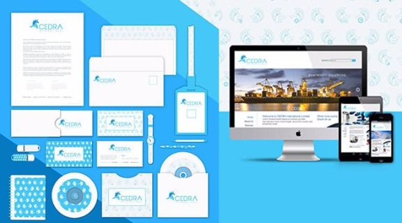
Cedra Branding campaign by Quí Nguyễn. Creative brief specified specified design for print and online.
Who’s their audience or target market?
Have them describe their usual customer. What’s their age range, race and gender? What type of businesses are these customers involved with? How often do they buy or use their service?
Get more details: Make a "Persona" or ideal user. Can they put a face to that customer? For instance, is it a 30-something male or stay-at-home-mom?
Who’s their competition?
Why do they think a particular company or companies are their competition? What do they offer that the others don’t? UVP (Unique Value Proposition). What does the competition offer that they don’t? What makes them unique?
Get more details: Ask them how they want to be different than their competition. Do their customers often confuse them?
Doing it right: Two coffee shops sell the same basic product, coffee, but they appeal to their audiences in quite different ways. Mad Cap Coffee Company is bright, bold and urban. Assuming their customers are young, hip professionals is probably right on. Coffee Supreme is earthy, mellow and rustic. Their customer is most likely a little older, aware of the environment and professional as well.
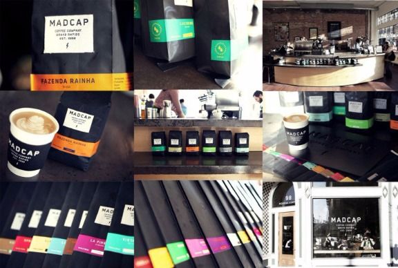
Mad Cap Coffee Company’s branding aesthetic is bright, bold and urban.
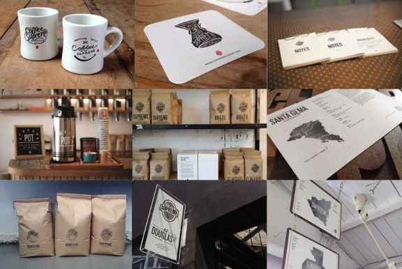
Coffee Supreme’s branding aesthetic is earthy, mellow and rustic.
What tone or image do they need to portray?
Are they high-end, helpful, friendly, techy or earthy? Do they want to be bold and dominant or easily approachable?
Get more details: What colors do they like and don’t like? Maybe their competition uses blue and green, so you want to make sure they don’t look similar. They may want a new logo but may need to stick with blues because they aren’t changing the look of their website right now. The CEO may also despise the color purple, so this is all good information to know ahead of time. You may want to ask what fonts appeal to them. Show them a variety of serif, san serif and script fonts. Do they like straight-laced fonts that show seriousness? Or do they go for the scripty, handwritten ones that show they’re playful and welcoming? Is the photography they’re using professional or whimsical? This will help you figure out the tone of the design pieces.
Doing it right: Create a Mood Board. Pinterest makes it super-easy but you can also create them on a bulletin or cork board. Tear out ideas from magazines, grab color swatches from a paint store and anything else that inspires you such as pieces fabric or postcards. Start with a color then add fonts or type treatments. Look for photos that illustrate their perfect customer. It’s just like putting together an outfit or decorating a room.
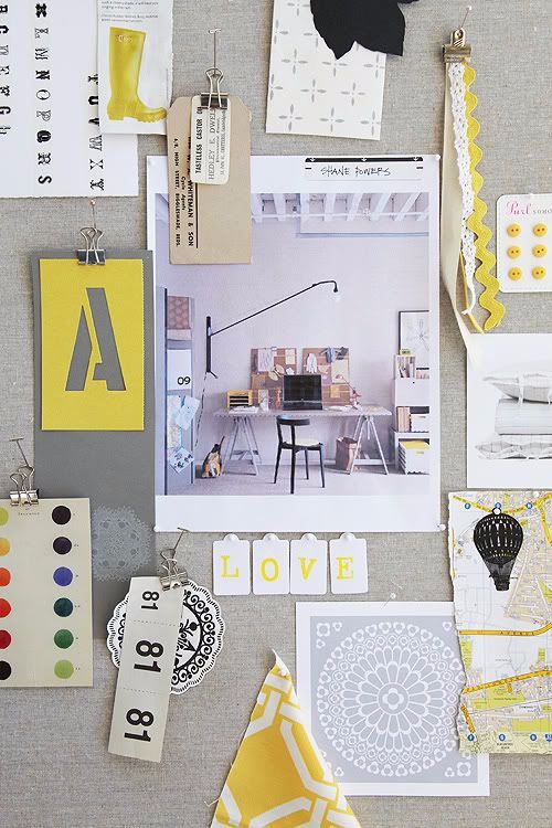
Shrimp Salad Circus mood board.
What is their ultimate goal and how will they measure it?
Are they looking to grow their mail list, get more clients, gain awareness, sell more of their product or change their image? Ask how they’ll measure success of the campaign or the piece. Is the goal 4,000 subscribers? Do they want to increase their sales by 10 percent? If you’re only designing a new logo for them, there may not be any measurable results, so ask how the new logo will be used and how it fits into their new business plan.
Get more details: Do they have a CTA (Call to action))? Are they looking for customers to click through to buy their product, sign up for a course or make a phone call? Facebook now has a Call To Action button. How can they use that as part of their marketing?
Doing it right: When designing the marketing campaign for songwriter Sara Lyn Baril, the call to action IS the campaign — and so easily measurable. The results are immediate so marketing efforts can be changed, if need be, to get the desired results.
What’s their budget?
This is the amount they have available to pay you. It also gives you guidelines in which to design. You don’t want to design an annual report that they can’t afford to print. Nor do you want to spend 20 hours designing a piece when they’ve only budgeted enough for 10.
Get more details: For instance, make sure they define whether the design budget is separate from the web development piece. Does the budget include any copywriting or photography? Do they need to have materials printed? If so, did they already get costs for that and have budgeted that separately?
How should approvals and presentation of concepts be handled?
Ask if they’ll be the main contact person for the entire project and if they’ll have final sign-off on all materials.
Get more details: If anyone else is to be included on approvals, make sure to get their name, email address and phone number. Once you have concepts to present, will you need a Skype session to present to more than one person or can you email files over with an explanation of your ideas and designs?
Doing it right: Putting the creative brief online for the design team is a fantastic idea.
With links to the client’s website, design files and the examples they like, it’s everything you need right at your fingertips. Connect Communications, Inc.’s brief is short but concise: It has every piece of information that you’d need, including how much they’re paying, what date the project started and who all of the contacts are.
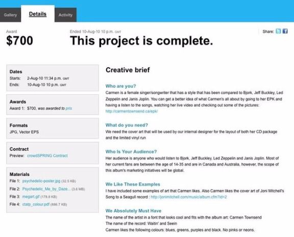
Connect Communications, Inc.’s brief is short but concise.
What previous design and marketing materials have they used?
What marketing materials do they currently use? Besides looking at their website, ask to see what they’re using now. What marketing pieces do they like and which ones are working for them? What’s not working for them and why?
Get more details: Do they have existing brand guidelines? Will they supply their logo in an EPS, JPG or PNG format? Do they have required fonts or colors? If they’re hiring you to create a new brand for them, what is your place in that process? Are you selecting the fonts, colors and creating the logo that will be their future guidelines, or is there a creative team involved?
Are there other people responsible for other pieces of this project?
This is necessary information when you’re scheduling due dates and setting expectations with the client. If you need to rely on others for information you’ll need before designing a piece, you should make sure the client provides it to you before you begin work.
Get more details:
- Will website copy come from a copywriter?
- Is a photographer taking photos?
- Is there going to be an illustrator involved?
- All of those pieces should be completed and approved before they’re sent to you.
Every design brief doesn’t have to include all of this information. It’ll usually vary from project to project but the more you ask, the more you get — and the more clarity you’ll have about what your client needs.
As soon as the initial call is done:
- Go through your notes and type up a clear, detailed brief for yourself and share it with anyone else on your team.
- Add links to the client’s website and social media profiles so they’re handy.
- Add all contact names, numbers and emails.
- While your mind is fresh with ideas and excitement, jot down a few design ideas so they don’t vanish.
- It’s also a good idea is to put all deadlines immediately into your calendar and set up a thorough task list.
You should also plan on keeping the Design Brief within view as you create concepts. It’s easy enough to put it in a pile and think you’ll remember everything. Review it again before you begin to design and again before you’re ready to present your concepts to confirm you’ve met the goals.
Recap: A successful project starts with an excellent creative brief
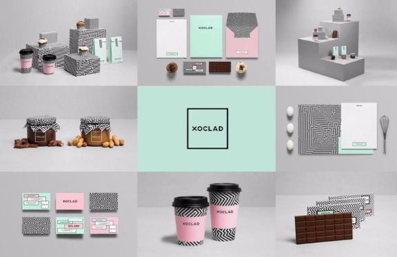
Finished product: branding campaign by design firm Anagrama for Xoclad.
A detailed and thoughtful design brief will lead to a successful end product — whether it’s a logo, brochure or entire branding campaign. If you’ve nailed their target audience, know their budget, have a detailed list of all materials needed and know what their ultimate goal is and how they’re going to measure it, you end up with a beautiful campaign that the client will be pleased with. And it’s flexible enough to use across many platforms, will put them on the road to success and will also be a fabulous portfolio piece for you.
Let’s discuss: What’s the difference between a brief that works, and one that doesn’t?
That’s biggest difference between briefs that work and other that don’t are whether they contain all of the necessary information you’ll need for a project. Briefs don’t have to be pretty, but they have to informative. Here we compare three case studies, and look at what works best.
Case study #1
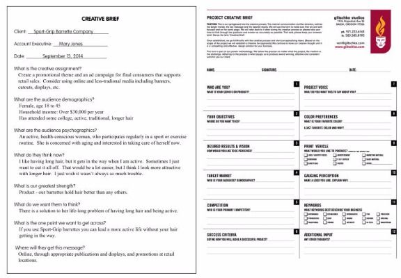
Andate Publishing brief vs. Glitschka Studios brief
The first brief, from Andate Publishing, while it contains a good deal of useful information, lacks just as much. The team knows what the overall project is, Who the Audience is and What their Strengths are. But what they don’t know is who the contact person is, what the budget or deadlines are and What the Tone should be. Now take a look at the brief from Glitschka Studios. They ask many of the same questions about scope of project and audience. But they also want to know their color preferences and tone, where the materials will be printed and how to measure success of the project.
Case study #2
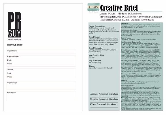
PR Guy Online brief vs. TOMS Shoes brief
The first brief, from PR Guy Online is much too brief (no pun intended). The team knows the contact info and the Project Scope, but what about budget, deadlines and competition. While they may think they’ll add that all under project scope or background, they may forget to ask once they’re interviewing the client. It’s better to have it all spelled out. Now take a look at the brief from TOMS Shoes. This is a super-thorough brief. The designer knows what the project objective is, tone, message, why buyers should believe in TOMS and what buyers believe in. They’ve included theme, a brand character and space for project approvals.
Case study #3
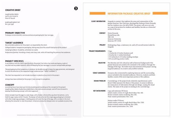
Laughing Man Media brief vs. Krista Kennedy brief
Again, we have too little information gleaned from the first brief from Laughing Guy Media. The designer knows the basic project objective but even that’s vague. They know the audience and project concept but have no idea about tone or deadline. Who’s their competition and what are they currently using for marketing? Now jump over to the brief for Krista Kennedy. It’s clean and concise. Scope of project, contact info, problem to solve, audience, sizes of materials needed and deadlines for all pieces are included.
Inspired? Download this free template and start planning your next creative project.
Whether you’re a designer working with a client, or a solo-preneur starting a new business – planning is the foundation of every creative project. If you’ve never used a creative brief before, now’s the time to do so!
Simply click on the creative brief below to download it and share with your friends. We’d love to hear how you go – share your experiences in the comments below!

comments powered by Disqus