Makeover Mania
Inside the 21st-Century Craze for Redesigning Everything
By ROB WALKER NOV. 10, 2016
1. The Problem
In theory, the redesign begins with a problem. The problem might be specific or systemic or subjective. A logo makes a company’s image feel out of date. A familiar household object has been overtaken by new technology. A service has become too confusing for new users. And so on. The world is, after all, full of problems.
The human desire to solve problems fuels brand-new inventions too: The wheel, for example, eased conveyance significantly. But the redesign tends to address problems with, or caused by, dimensions of the human-designed world, and identifying such problems may be the designer’s most crucial skill. Redesigns fail when they address the wrong problem — or something that really wasn’t a problem in the first place. While progress may entail change, change does not necessarily guarantee progress. But a clever redesign, one that addresses the right problem in an intelligent fashion, improves the world, if just by a bit.
As an example in miniature of how the redesign is supposed to work, consider New York’s bike-share program. In 2014, Dani Simons, then the director of marketing for Citi Bike, visited a School of Visual Arts interaction-design class and presented it with a problem to solve. Citi Bike was selling plenty of annual memberships, but it was failing to attract enough "casual" riders, the sorts of one-off users who might rent a bike for just a day or a week. The class went into the field, observing and interviewing people at Citi Bike stations, and at their final meeting, the students presented Simons with their findings — and potential solutions.
Simons was so impressed that she signed two students, Amy Wu and Luke Stern, to a three-month contract that summer. The two of them soon zeroed in on a particularly thorny design problem: the big, instructional decal on Citi Bike’s kiosks. Annual members used a key fob and had no reason to interact with the decal, but it was the gateway for casual users. Consisting mostly of text, the decals were dense and off-putting, especially to tourists uncomfortable with English. Some failed to understand that they were supposed to type in a code from a printed receipt to unlock a bike; instead, they tried to figure out how to insert the receipt itself into a slot on the docking station.
There was another, more prosaic reason that Stern and Wu focused on the decal: It was something they could actually change. Citi Bike is operated by a private firm, but New York’s Transportation Department oversees it, too, and the technology involves an external vendor. The decal, however, was produced in-house. So Stern and Wu proposed refashioning it, using a set of instructional pictograms loosely inspired by Ikea booklets. They tested several prototypes and endured baffled responses from Citi Bike users until eventually landing on a gridlike arrangement of visuals that people found intuitive. Simons and the Transportation Department signed off on a final version, and it was installed on the city’s 300-plus Citi Bike stations. Wu checked the service’s publicly available user data a month later and discovered that casual ridership had increased about 14 percent. "It was a little bit surreal," Stern recalls. "We can actually make a difference."
Indeed, this is the platonic ideal of the redesign: A designer sees a problem, proposes a solution, makes a difference. Such tidy narratives fuel a reigning ideology in which every object, symbol or pool of information is just another design problem awaiting some solution. The thermostat, the fire extinguisher, the toothbrush, the car dashboard — all have been redesigned, whether anybody was clamoring for their alteration or not.
This hunger for change has been a boon for firms like IDEO. Tim Brown, the company’s president and chief executive, has overseen IDEO’s steady expansion from product design to interactive and service design for businesses like Bank of America and Microsoft, and in more recent years even for municipalities and governments. He has been a vocal proponent of the idea that "design thinking" can be applied to just about any problem. "There are two takes on the redesign," Brown says. "The glass-half-empty take on redesign is, ‘Oh, we’re unnecessarily redesigning a chair,’ or a lamp, or whatever."
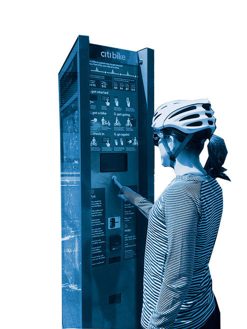
Problem: not enough casual users. Solution: reworking the instructions for newcomers from a text-heavy approach to something more pictorial, reminiscent of Ikea instructions.
Credit MotivateThe glass-half-full take requires a broader perspective: "The need to redesign is really dependent on how fit for purpose the thing in question is," Brown says. In his thinking, much of our world is built around systems designed to respond to the social structures and technologies of the industrial age. Everything from systems of education and health care to the design of cities and modes of transportation, he says, all trace their roots to a drastically different era and ought to be fundamentally rethought for the one we live in now. "I think we’ve potentially never been in a period of history where there are so many things that are no longer fit for purpose," he says. "And therefore the idea of redesign is entirely appropriate, I think — even though it’s extremely difficult."
2. What to Change
You don’t have to listen to Karim Rashid for very long to get a sense that he thinks pretty much every single manifestation of the built environment needs to be redesigned. Known for his colorful personal and professional style, he has had a long run as one of the most famous industrial designers in America. He believes design is a fundamentally social act that makes the world a better place. But it is also, he points out, a business. So in practice, most redesigns begin with a client; without one, not much happens. He has worked with many of them — on furniture, packaging, gadgets, housewares, luxury goods, even condos and hotels. But he has learned that even having a client does not guarantee that any given redesign will ever make it out of renderings and prototypes and into the real world. "People say I’m prolific," he says. "Can you imagine if all the other stuff got to go to market?"
As Rashid sees it, so many of the things that surround us bear cumbersome vestiges of the past. "The world is full of this kind of kitsch history — history that has nothing to do with the world we live in now," he says. He points to a redesign project of his that fizzled, a complete rethinking of the business-class tableware for Delta Air Lines. His proposal was bold: His bowls had sharp angles that echoed Delta’s triangular logo, his trays had subtle recesses that anchored dishes in place and his wineglasses skipped the stem in favor of a tapered shape with a wide base.
"The stem on a wineglass is meaningless," Rashid says. He dismisses the conventional argument that it prevents the drinker’s hand from interfering with wine’s ideal temperature; to have the slightest such effect, he claims, you’d have to wrap your palm around the bowl for 20 straight minutes. The stem is actually a leftover artifact, he says, from centuries ago, when goblets made of metal had high stems to signal status and wealth. This design quirk remained after we switched to glass, Rashid says. Making wineglasses look a certain way because that’s how they have always looked is a classic example of privileging form over function. "I’m sitting in first class or business class on an airplane with turbulence," Rashid says, "with a wineglass with a stem on it — do you understand? It’s so stupid, isn’t it?"
His proposed redesigns were striking, but they had to pass muster with the service-item maker, the flight attendants’ union and Delta itself — which ultimately declined to move forward with the concepts Rashid proposed. "It was all rejected," he tells me, with a sigh. "Because it doesn’t look like domestic tableware."
Rashid loves to "break archetypes," in effect redesigning a whole object category. But the hurdles to doing so involve practicality as well as taste. More recently, he designed the Solarin mobile phone for Sirin Labs. It is equipped with extreme encryption capabilities and made with wealthy, privacy-obsessed customers in mind. It costs an eye-popping $12,000 and up. The client had a sky’s-the-limit attitude about imbuing the phone with a truly distinct form.
Rashid proposed an oval shape. "It would fit perfectly in your hand," he says. His concept made it to prototype, and "everybody loved the oval phone." But it turned out that only a handful of factories do smartphone glass assembly, and none were willing to retool an entire production line to accommodate a relatively small client. Moreover, existing operating systems are all designed to work in a grid format. The phone ended up with pronounced beveling at the edges, but was still fundamentally a rectangle. "I was so, so disappointed," Rashid says. "I tried every trick." Sounding almost wistful, he recalls a similar misadventure: an oval-shaped television set he designed for Samsung. "They showed it in some focus group, and it bombed," he says, laughing. "People didn’t like the idea of an oval television. I have no idea why."
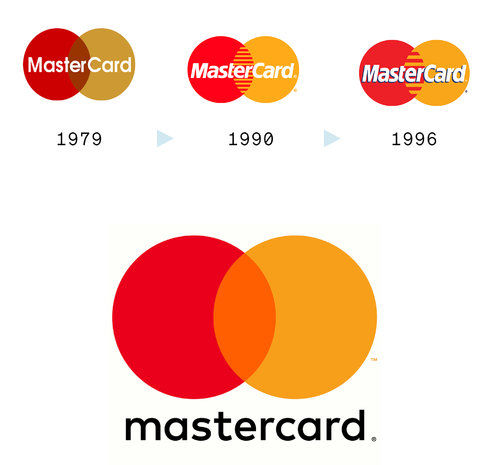
The payment giant’s top priority in revisiting its logo for the first time in decades: Don’t mess it up. The result, released earlier this year, is a version of the familiar interlocked-circles symbol streamlined for the digital era.
Credit3. What to Keep
I know why. And really, so does Rashid. As much as we are attracted to the new, we simultaneously cling to the familiar. This tension means that some redesigns — particularly in the realm of graphic design — can inspire surprisingly visceral public backlash. Earlier this year, for instance, Instagram updated its logo and app icon, simplifying the design and making it more colorful. The chorus of online moaning and mockery that followed grew so loud that it was actually reported on by The Times, which called it a "freak out." Instagram didn’t budge, but a similar backlash in 2010 caused the Gap to retract plans for a new logo it had floated online. The University of California pulled back key elements of a redesign that met with a similarly furious response.
Probably the most notorious and consequential example involved Tropicana. In 2009, the brand rolled out a new look that included a full redesign of its familiar packaging and visual identity, dropping its orange-with-a-straw-in it logo — corny, perhaps, but very familiar — for a more stylish icon and a sans-serif type treatment. Fans howled online, but that probably mattered less than the reported 20 percent drop in retail sales. The redesign was withdrawn, and the brand went back to its old look.
Situations like this can unnerve clients, and this knowledge was certainly relevant to Mastercard when it decided this year to update its logo for the first time in more than 20 years. Raja Rajamannar, the global chief marketing and communications officer, says that the first parameter he gave his designer, Michael Bierut at Pentagram, "was not to mess things up." The online crowd can get "pretty nasty," he explains. "We don’t want to get mired in unnecessary controversy and negativity."
This conservatism among clients can frustrate designers. "I was kind of brought up in this tradition that, you know, there’s nothing more inspiring than the blank slate, the open brief," Bierut says. But over the years he has come to appreciate the challenge of "starting with a given," particularly now.
"The last big period of redesign was the postwar era," Bierut says. "There was this mania to make older companies look new and modern." As a more corporate world emerged, the visual vernacular of mom-and-pop businesses looked quaint, and so design shifted from an emphasis on manufacturing things to selling more abstract forms of value. A railroad doesn’t run trains, the thinking went; it provides transportation — so instead of a representation of a locomotive, its more modern logo might rely on arrows and italic typography. More broadly, idiosyncratic or hand-drawn lettering gave way to stylized and minimal iconography and type treatments that projected far-flung and trustworthy power. "Corporate design was done as a command-and-control exercise," he says, resulting in a master solution laid out in "a thick binder" prescribing how every branding element would appear.
By the ’80s and ’90s, that approach started to feel dated, suspicious and at odds with a vogue for more agile management theories. So in the last two decades, there has been a fresh wave of redesigns as companies have repositioned themselves in a more globalized, technologized marketplace. Mastercard is one of many examples of a company looking to update visual strategies designed with billboards and brick-and-mortar stores in mind for the age of social media and a transnational customer base.
Nevertheless, the specific dimensions of Mastercard’s "don’t mess it up" parameter included keeping the interlocking circles — one red, one yellow — that the brand has used for more than half a century. Bierut believes that this was wise: Unlike a book cover or a poster, a brand mark is "more like a building," he says. "You don’t unveil it thinking it’s going to work once and then be on its way. It’s supposed to accrue value the longer it’s invested in." The raw familiarity that builds up over years, which marketers refer to as "equity," probably plays a bigger factor in our assessment of a supposedly great logo design than we realize. Bierut is tickled, for instance, by how many people seem to admire Target’s logo. "I can’t imagine if you went to your client whose name was Target and said, ‘I’ve got an idea,’ then you went away for a few weeks and came back with a circle with a dot in the middle, and an invoice," he says. "The client would be skeptical — and the world at large would destroy you."

IOS 7
Apple’s 2013 mobile operating system did away with ‘skeuomorphs’ — visual echoes of physical-world objects like wooden bookshelves and green gaming tables, long a bugbear among some digital designers.

AirBNB Logo
In 2014 the home-sharing platform adopted a stylized A as its logo — which was instantly mocked by those who thought it resembled certain parts of the human anatomy. The company stuck with it anyway.

$100 Bill
It took more than a decade to develop the more colorful version of the Benjamin that began circulating in 2013. Its look was largely shaped by functional considerations aimed at thwarting counterfeiters, like a blue strip that seems to show movement when tilted.

Whitney Museum Visual Identity
In preparation for its move to a new space in 2015, the museum switched its logo to a minimal, ‘responsive’ W that’s rendered at various angles depending on the imagery with which it’s paired. Some complained, but design geeks loved the variety.
linknyc
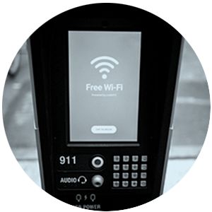
An attempt to update the pay-phone concept for a smartphone world is adding Wi-Fi connectivity, shiny obelisks and ad-bearing screens to New York sidewalks. After complaints, however, it cut off the kiosks’ built-in browsers when some users started to hang around watching pornography.

The Wheelchair Symbol
Technically known as the International Symbol of Access, this icon was targeted by a campaign called the Accessible Icon Project. Its more active-looking alternative has joined the Museum of Modern Art’s permanent collection and was officially approved for use in New York State in 2014.

Trump-Pence Logo
The initial version featured a symbol with a T and P interlocking in a manner that many online observers considered ... suggestive. It was quietly and almost instantly replaced with a text-only version.

Quirky Pivot Power
This redesign of the power strip emerged from Quirky, a V.C.-backed start-up that did collaborative product design. Quirky declared bankruptcy last year, but its ‘community’ produced a hit with this object, which has sold more than 1.5 million units.

Yahoo Logo
A 2013 modernization of the company’s Web 1.0 logo was poorly received — not least because Marissa Mayer, the company’s C.E.O., announced that she and a small internal design team had knocked it out ‘one weekend this summer.’

Nest Thermostat
With a modern look and high-tech capabilities (control from a smartphone, data collection and a promise to ‘learn’ from usage patterns), the Nest jolted a long-sleepy category in 2011 — and became an early icon of the ‘smart object’ phenomenon.
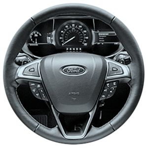
Ford Smartgauge
With LCD screens on the dashboard allowing digital instruments to replace mechanical ones, Ford offered owners of hybrids new forms of driving feedback to coach them toward better mileage.

Bullet Journal
One designer’s personal mission to stay organized evolved from a custom system of productivity-tracking into a hit product on Kickstarter that effectively redesigned the to-do list.

Metropolitan Museum of Art Logo
Dropping its venerable grid-based mark for bright red smushed-together letters this year, the Met took a lot of heat — and not just from the online mob. New York Magazine’s architecture critic called it ‘a typographic bus crash.’
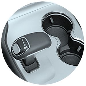
The Fiat Chrysler Monostable Gear Shift
A new take on the automatic shifting mechanism confused some drivers who thought their vehicle was in park when it wasn’t. The unfamiliar design was blamed for injuries and sparked a huge recall.

Army Camouflage
A pixelated pattern introduced about a decade ago was criticized for being insufficiently concealing (a pretty big flaw in this context). That was revised after five years, and that redesign has now been replaced by a more traditional-looking pattern.

American Airlines Visual Identity
In 2013, before emerging from a Chapter 11 bankruptcy, the airline replaced the logo and plane livery it had used since the 1960s with a more abstract image scheme. ‘It has no sense of permanence,’ declared Massimo Vignelli, creator of the discarded look.

Facebook Timeline
The social-media giant always seems to be fiddling with the algorithms that guide what users see. In 2013, it revised how users display what they’re willing to share about themselves. For Facebook’s ad-driven business model, the more we share, the better.
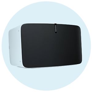
Sonos
Founded in 2002, Sonos took years to redesign home listening into its current product line: a range of streamlined, Wi-Fi-compatible objects controlled by an app. The only tangible element of the old-school hi-fi system you still need may be the speaker.
For Mastercard, Pentagram got as creative as the brief allowed, offering dozens of yellow-and-red-circle variations — adding additional colors to suggest inclusivity, or a superminimal take presenting only the outlines of the interlocked rings. Rajamannar (and others at Mastercard, crosschecked by multiple rounds of market research) passed on those, opting for a treatment that amounted to a kind of reiteration of the existing mark. The colors became a little brighter, a set of stripes in their overlap was eliminated in favor of a single orange-y color and the name moved below the circles. Ultimately, in fact, the new symbol is designed to be able to stand alone, with no name at all; Rajamannar says testing conducted across 11 countries found 81 percent of respondents recognized the wordless version of the logo as Mastercard’s.
In short, the not-messing-it-up mission was deemed a success — and there was no notable backlash. "This kind of brand mark has become more ubiquitous than the designers of the ’60s and ’70s ever would have dreamed," Bierut says, and that may explain a public interest in design that would have been a shock in that era. It should not be so surprising today; the design profession has been on a decades-long mission to have its work taken seriously across the culture. But now, having achieved what they wanted, many designers seem to wish the public would be more deferential — something Bierut finds amusing. "If designers claim to want people to be interested and invested in and care about design," he says, "they sort of have to accept that interest on the terms of, you know, the audience."
4. Where to Compromise
In 2011, Jamie Siminoff had just sold a start-up and was spending most of his days in his garage in Pacific Palisades, Calif., determined to come up with a new business concept. Tinkering with ideas including a gardening business and new conference-call technology, he soon became annoyed, because he could never hear his doorbell, and he kept missing visitors. So he "hacked together" a system that linked the bell to his phone. His wife told him that it was far more useful than the notions he was chasing in the garage. The idea evolved to include a camera and a motion detector — and thus the ability to monitor your front door from anywhere, with a smartphone, making the object as much about security as convenience.
The product he ended up with, Ring, is a good example of a broader phenomenon in the world of industrial design. The technology shifts that Brown and Rashid cite have quickened the pace of redesigns in more mundane, less grandiose ways. Thanks to the proliferation of cheap sensors, circuit boards, cameras and other components, practically every consumer good now seems susceptible to reinvention as a "smart object." Even the path Siminoff traveled from concept to design was made easier by technology and start-up mania, first with the aid of a crowdfunding campaign, then with an unsuccessful but profile-raising appearance on "Shark Tank."
Sometimes such a path results in a version of what the tech critic Evgeny Morozov calls "solutionism" — starting with a supposed breakthrough and then seeking out a supposed problem that it can hypothetically solve. And at times the presumed innovations in these tech-centric redesigns seem to run well ahead of their potential privacy and security pitfalls. ("Yes," the tech site Motherboard reported last year, "your smart dildo can be hacked.") But sometimes it results in a hit, like the widely celebrated update of the thermostat in internet-connected, app-controlled form created by the start-up Nest, which was ultimately bought by Google for $3.2 billion.
By his own account, Siminoff’s first stab at the product was a bit off. He called it Doorbot, and its look matched the geeky name: a vaguely sci-fi, curved object with a camera concealed by a spooky, bulbous protrusion. "That was the pride of the design," Siminoff says now, laughing. He prototyped it in his garage with a couple of recent college graduates; none of them had a design background. The marketplace set him straight, he says: "No one wanted this big HAL 9000 thing on the front door." He still believed in the object’s utility, but he realized he would need to redesign his redesign.
Siminoff found his way to Chris Loew, an industrial designer in Silicon Valley, with a long record in technology hardware; he worked on early versions of tablet products and spent 16 years at IDEO helping clients including Samsung and Oral-B. In more recent years he has been hired by a number of start-ups. Impressed by Siminoff, Loew also recognized the issues with Doorbot. "It was very gadgety," he says, wryly. "You didn’t know if you were being shot with radiation or — you know, it’s not offensive, but you didn’t know what it was." In short, it didn’t look like a doorbell, and even the most impressive technical capabilities have to be presented in a form that makes sense to the consumer.
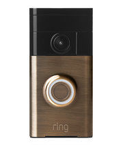
The original version of this reimagined doorbell (equipped with a camera and intercom) had such a sci-fi look that visitors often didn’t know what it was. A redesign of that redesign has placed it in the realm of functional home décor — and it has been installed in hundreds of thousands of homes.
Credit Gear ShiftIn this case, that meant a design that resonated with basic home architecture. There were already serious technologized constraints: It had to accommodate a fairly large battery, a camera, a circuit board and a motion detector that required an opening of a specific size. And from a purely aesthetic perspective, the architectural setting imposed limits that might not apply to a free-standing product: Nobody really wants to tack a wild experiment in product design to a front door. Loew settled on a rectangular shape that would visually echo molding. "Everybody’s house is really just extruded shapes and planar shapes," says Loew, who is now Ring’s lead product designer. The product comes in various finishes informed by classic door hardware, and is meant to be notable but not flashy.
The company has grown to 500 employees, with hundreds of thousands of installations already done. The only holdover from Doorbot is a circle around the button that glows blue when pressed.
5. When to Start Over
Sometimes the route to a successful redesign leads directly through a decision about what problem not to solve. A few years ago, for instance, an entrepreneur named Richard Smiedt approached Karim Rashid with an idea for a set of travel bags and cases that could be used individually or fit together, according to the needs of any given trip. Recently, in a conference room in Rashid’s Manhattan offices, Smiedt clicked through a set of slides depicting the various ideas the designer had come up with over the course of their many collaborations.
"A lot of what you get with Karim," he said, gesturing at a shelf full of Rashid-designed products and their curves and skewed lines and loud colors, "is this, reinvented." He paused to clarify his point: "I totally want what he’s done. I just don’t want it to look like any specific thing that he’s done."
Smiedt paused on one image of a carry-on bag with a side pocket containing a flask-shaped plastic bottle outfitted with a strong microfilter. This accessory popped up during the luggage-design process as a useful alternative to buying bottled water after every airport security check. "So no matter what country," Rashid explained, "I go across and to the bathroom and fill it up with clean water. Because it’s absurd, this idea of drinking bottled water — the landfill is enormous, 18 million bottles are thrown away a day in America." Both men immediately saw its appeal. Smiedt promptly "disappeared," Rashid continued, "and six months later came back and said: ‘You know, forget the luggage. We’re doing the water bottle.’ "
On its own, the flasklike form seemed off, so Smiedt pushed for alternatives, something more like what was on Rashid’s product shelf — but not exactly. An hourglass-like, squeezable shape that Rashid eventually dreamed up was perfect. But it required making a lengthy search to find a capable manufacturer — "Nobody had made a blow-molded bottle that was thinner in the middle," Smiedt said — and committing to a huge production order for the product, which they called Bobble.
"Companies are often risk-averse," Smiedt continued, "and don’t get design’s possibilities. But designers do what they want to design, and it often doesn’t connect with the consumer," at least not the mass scale he had in mind. "For me," he concluded, "the key to design is that it can’t polarize." Many designers would recoil from that assertion, but as a mass-market-oriented entrepreneur, Smiedt’s goals are different. He thinks a lot about who is not going to like a new take on a useful object, as a way to "get to something that’s really understood."
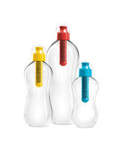
This new take on the reusable water bottle started out as an accessory to a luggage redesign. The luggage was scuttled — but Bobble, with a distinct shape and a strong microfilter, has sold millions.
Credit Karim RashiaThe Bobble bottle sold 15 million units in its first three years on the market. Smiedt sold Bobble to Seventh Generation and has gone back into business with Rashid, this time in a partnership. They want to redesign more travel-related accessories, so they started by dumping their luggage onto a table and talking about what they carried, and what they needed. Their first idea involved finding a way to keep smeary touch-controlled gadgets clean. Rashid designed a travel-size spray bottle, arriving at an elliptical form, more like a worry stone than a bottle. They both loved the object’s shape and feel but wondered about the breadth of its appeal. Ultimately, they shelved it, though not entirely.
They went back to the results of the bag-dump experiment and zeroed in on the most bothersome objects: the dull-colored, blocky, careless-looking power adapters and portable chargers and their various entangled wires. What if you combined a wall charger and mobile battery in a single object? What if it had a more appealing aesthetic? Smiedt sourced the technology, and Rashid designed around it to create an object they called Bump. Sifting through a box of prototypes, Smiedt pointed out that this completely different product has almost the same elliptical shape as the discarded cleaner idea. This "fun" form (it comes in magenta, red, black and blue) will carry through the entire product line, he explained. Rashid also devised a matching cable, and a clever silicone sleeve that is used both to store the cable and to protect Bump when it’s tossed into a bag.
Of course, there was a hitch. Market testing found that consumers were often happy to use Bump with the (less attractive) power cable they already owned, and didn’t bother with the sleeve. So as Bump goes on sale online and rolls out across big retailers, starting with the Container Store in late October, the cord is now sold separately. And that clever silicone sleeve may also be sold separately — or it may be on its way to a prototype box somewhere.
6. The Solution
All redesigns have something in common: They end. This does not happen at the moment the redesigned symbol, object or interface is implemented. It happens when that redesign is replaced. Maybe that’s the lofty logic of progress, or just the workaday logic of capitalism. But it’s certainly the logic of the redesign, and perhaps design in general, in the early 21st century. When IDEO’s Tim Brown talks about updating all that is not "fit for purpose" today, he’s talking about entire systems, not just their individual and tangible components and manifestations.
IDEO started out as an industrial-design firm working on consumer products; it expanded further into interaction design as the digital world took hold, and then it went into services. Now its projects include "redesigning" such abstractions as the school lunch (for the city of San Francisco) or the vote (for Los Angeles County), experimenting with how to lace in 21st-century technology elements and shed out-of-date practices. These are incremental efforts that play out over years. There is no momentous before-and-after unveiling, just a continuous process of researching, trying and replacing ideas. This, after all, is how designers work: in an ongoing system of study, hunches, prototypes, tests and do-overs.
The inevitability of re-redesign is something that Amy Wu (now part of a Microsoft design team in San Francisco) and Luke Stern (now a designer for Intersection, a firm focused on civic spaces) encountered in their work for Citi Bike. A few months after the triumphant installation of their redesigned kiosk decals, the company that operated Citi Bike was bought by another bike-share operator, Motivate, which runs similar programs for several other cities. They got an email from Citi Bike saying they might be needed again, but then never heard back.
The new owner promptly set about a broader upgrade of Citi Bike’s system involving new software and changes to the hardware in those kiosks. This meant that the decals needed to be redesigned yet again. The new ones incorporated some of Wu and Stern’s thinking, but in a new look that, among other things, visually announced to the world that Citi Bike had been updated.
Stern and Wu are philosophical about this turn. "The logistics had changed," Stern says. "They had to update the system. Our design wasn’t actually relevant any more. That’s reality, right?" Right. And it was certainly a useful final lesson for an effort that started out as a student project: All redesigns end, but the redesign never does. ♦
Rob Walker writes the Workologist column for The Times.
Source: www.nytimes.com
comments powered by Disqus