Many of you whippersnappers are too young to remember search before Google. Well this is what it looked like (and there were a bunch of others too)…
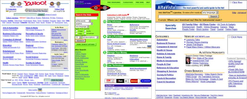
What’s all that cruft? Search options, advertising, links to sponsored stuff, non-search functions, and who knows what all else.
Besides the clutter, there was another, bigger problem: the search results. Search engines of that era either "crawled" the whole web, like HotBot, but were unable to display the results in a useful order, or they were based on a human-curated directory, like Yahoo!, but were not at all comprehensive. And as the web exploded in quantity of content, the chaos of crawler-based search and the lack of completeness of human-curated search both became increasingly painful.
Then…
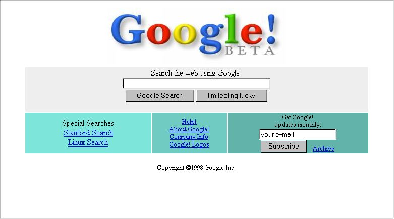
Wow! Clutter gone. (And even more-so in subsequent iterations.) Even more importantly, Google rolled out a search algorithm that sliced the Gordian knot to give users both comprehensive and relevant search results.
I remember the day I first tried Google. I had been using the crawler engines and often would use several for one search in hopes of finding relevant results. I liked the Yahoo! directory because every web page it suggested was of relatively high quality, but I knew a ton was missing there. Then I received an email from my father-in-law casually mentioning this new search engine called Google. He didn’t say much about it, but I was always open to trying something new that could have the promise of being better.
The simplicity of the interface caught me off guard. I thought maybe it was temporary since Google was so new and bore a "beta" label. So I wasn’t expecting much from the search. Then I tried it. I wish I could remember what my first search was, but in any event, I was stunned by the relevance of the search results. I was hooked, and I immediately began to use Google nearly exclusively. Google had instantly and exponentially improved my experience of using the web. Apparently it had the same effect on a whole bunch of other people, as well.
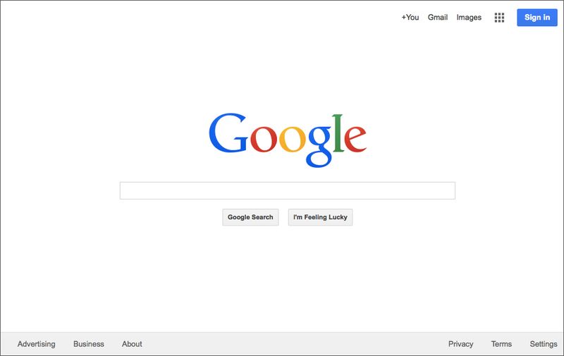
On the strength of this design — which has changed little over the past 16 years —Google has dominated search and has gathered the resources to take on initiatives that only nations could have taken on in years past. A design triumph, indeed. So what was (and is) so great about Google’s design?
The design genius of Google search
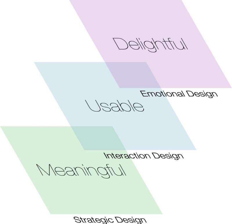
- Strategic design: create a meaningful experience.
- Interaction design: create a usable experience.
- Emotional design: create a delightful experience.
The strategic design of Google search was brilliant. The experience of the world wide web has always been heavily dependent on search. Yet the state of search in 1998 was such that users were continually pained by the lack of search results that were both complete and relevant. Larry Page and Sergey Brin saw this fundamental problem and set out to develop an algorithm that could be applied to a comprehensive database of web pages and rank results such that the top results were amazingly relevant to most users. Google’s search so thoroughly solved this problem that it upgraded people’s experience of the web itself. Then they leveraged the benefit they were providing to users with a revenue model that enhanced the user experience further by offering unobtrusive ads that matched what users were searching for. They married solving a major user problem to a great revenue model: fantastic strategic design.
Analyzing Google’s original search in terms of emotional design — which includes graphical design — may not be so obvious. It was not stunningly gorgeous, like maybe a Bing search page might be today. But the massive white space on the page was dramatic in its day and was, as it turns out, way ahead of its time. Google search has long served as an emotional oasis within the chaotic world wide web, and its fundamental design has stood the test of time.
A design that strikes such a beautiful chord of meaning, usability, and delight deserves acclaim, and Google has been justly rewarded for it. But what of Google’s design achivements since this initial breakthrough?
Why Google may never do it again
Google search was a brilliant, transformative design. But Google has not repeatedly churned out well-designed products. Since its initial search design, Google Maps is arguably the only other Google product that truly disrupted incumbents through its design. Yet Google did not design Maps, but purchased it from a company called Where 2 Technologies out of Sydney, Australia. I do not think it is crazy to consider that Google’s initial great design in search may have been an enormously beneficial (at least to Google) cosmic accident.

Larry Page seems to care about design, but with an empahsis on beauty, not on how design thinking can be used to solve problems. Under Page’s leadership, Google’s development of Material Design is commendable as a means of establishing a common aesthetic for Google products and and to promote ease-of-use. But it seems to me that Google remains an engineering-led company at its core as much as Apple is a design-led company at its core. Google believes in technology and applies design as a final layer of polish.
comments powered by Disqus